Argan Magic
/* Mobile (default) */
.contact-title{
font-size: 50px;
line-height: 1.0; /* space between wrapped lines */
margin: 0 0 16px; /* optional spacing below title */
}
/* 768px and up */
@media (min-width: 768px){
.contact-title{
font-size: 70px;
line-height: 1.1;
}
}
/* 1200px and up */
@media (min-width: 1200px){
.contact-title{
font-size: 100px;
line-height: 1.05;
}
}
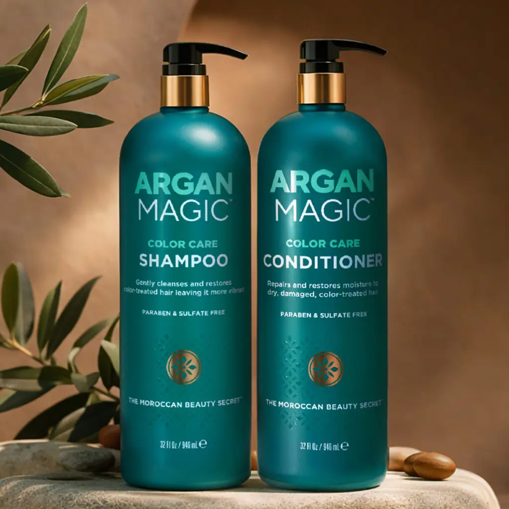
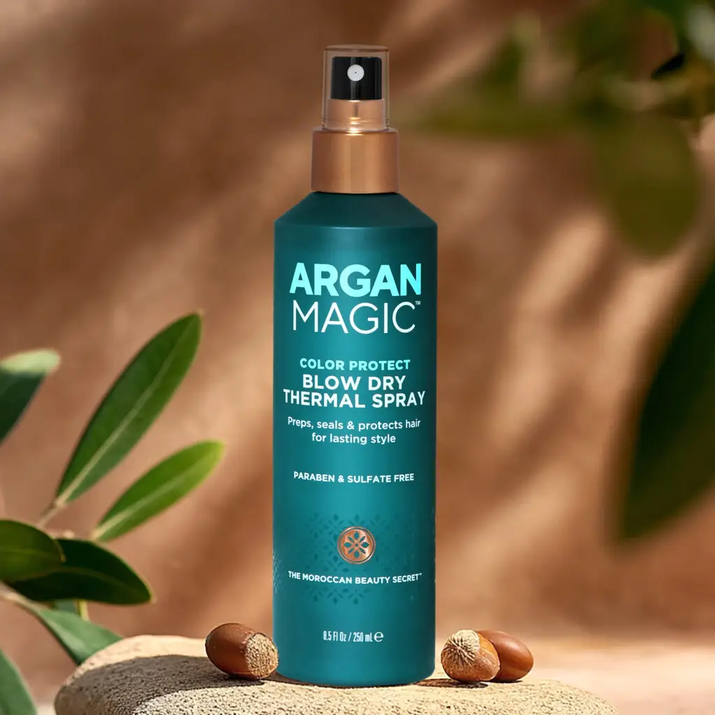
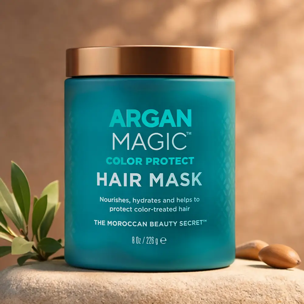
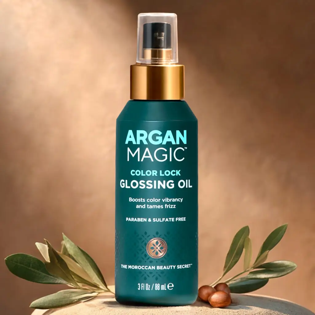
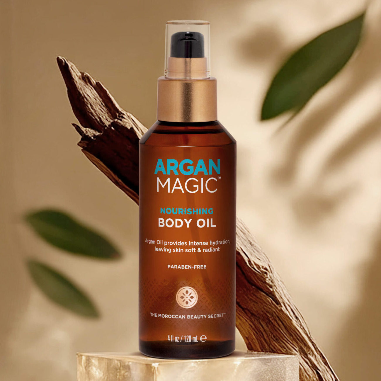
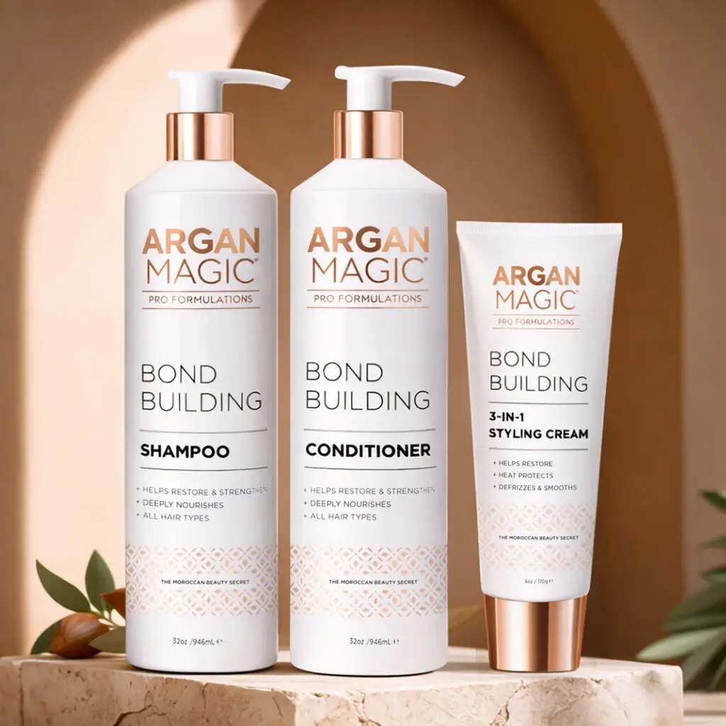
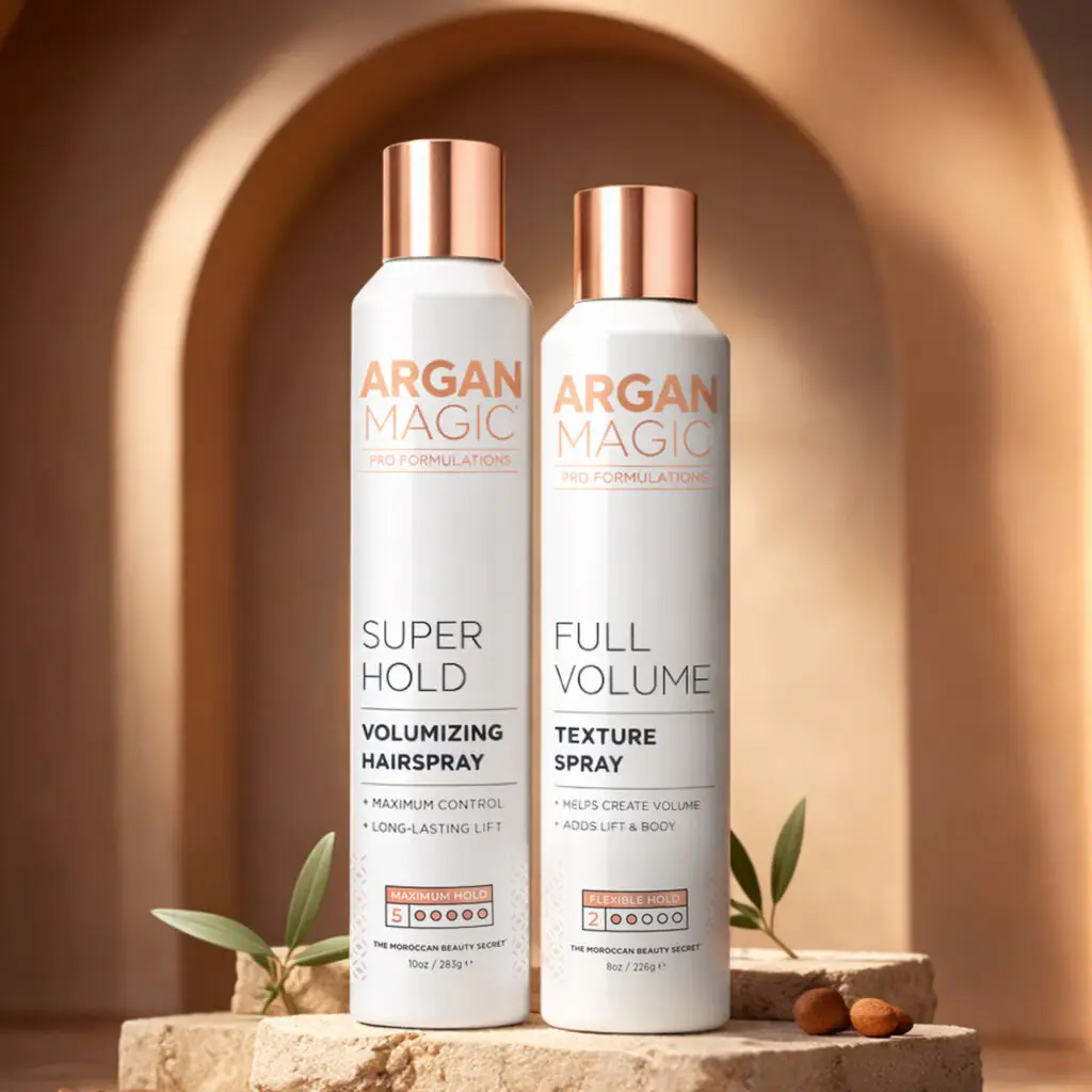
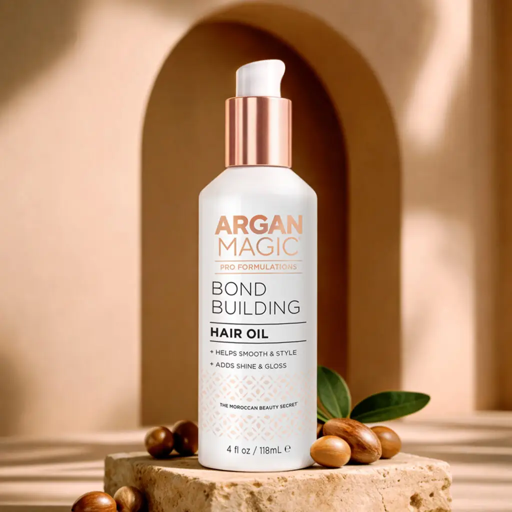
Argan Magic blends Moroccan argan oil with modern science to deliver silky hair, radiant skin, and effortless glow every day.
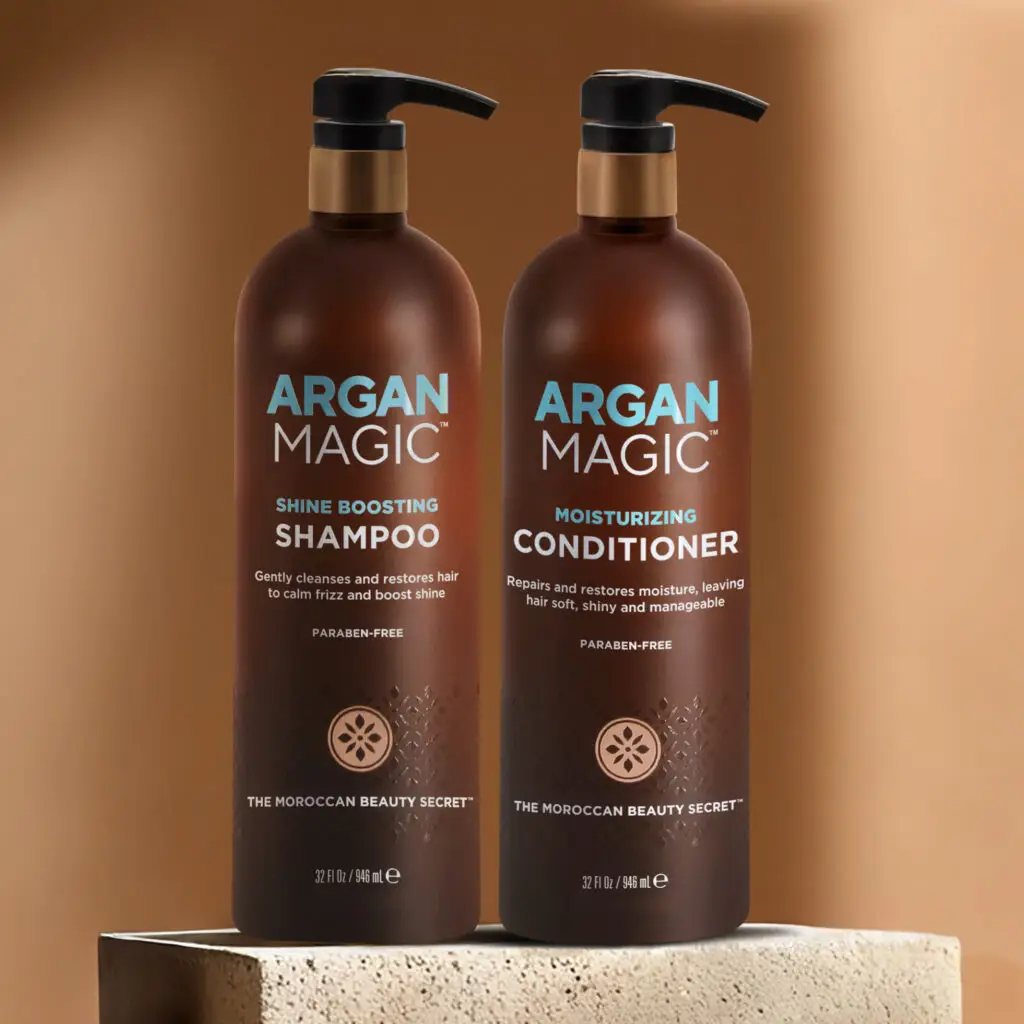
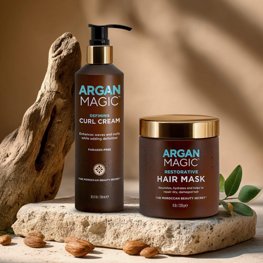
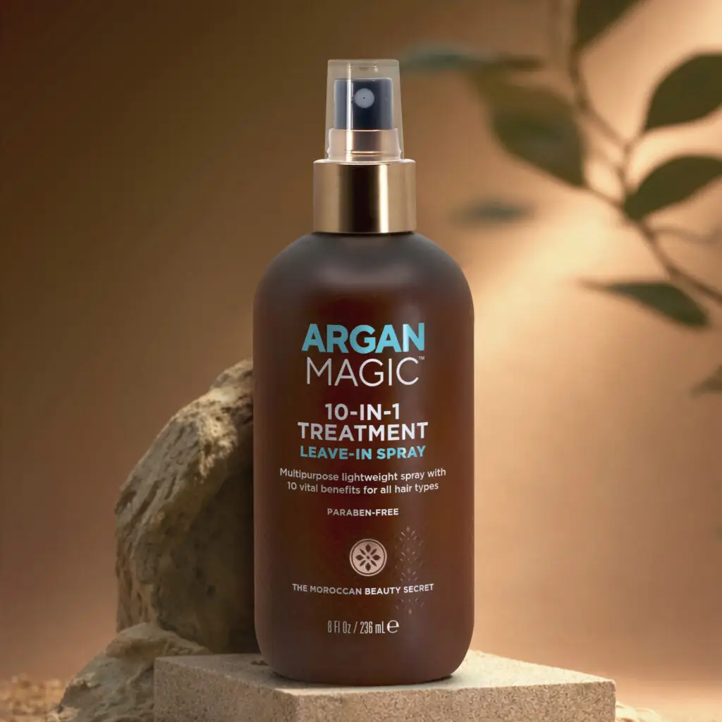
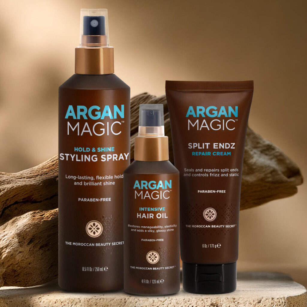
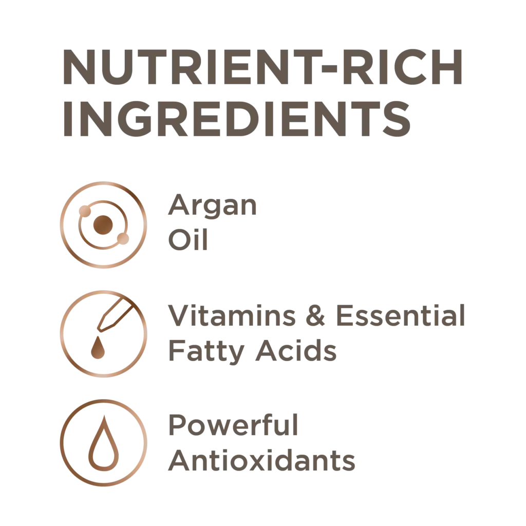
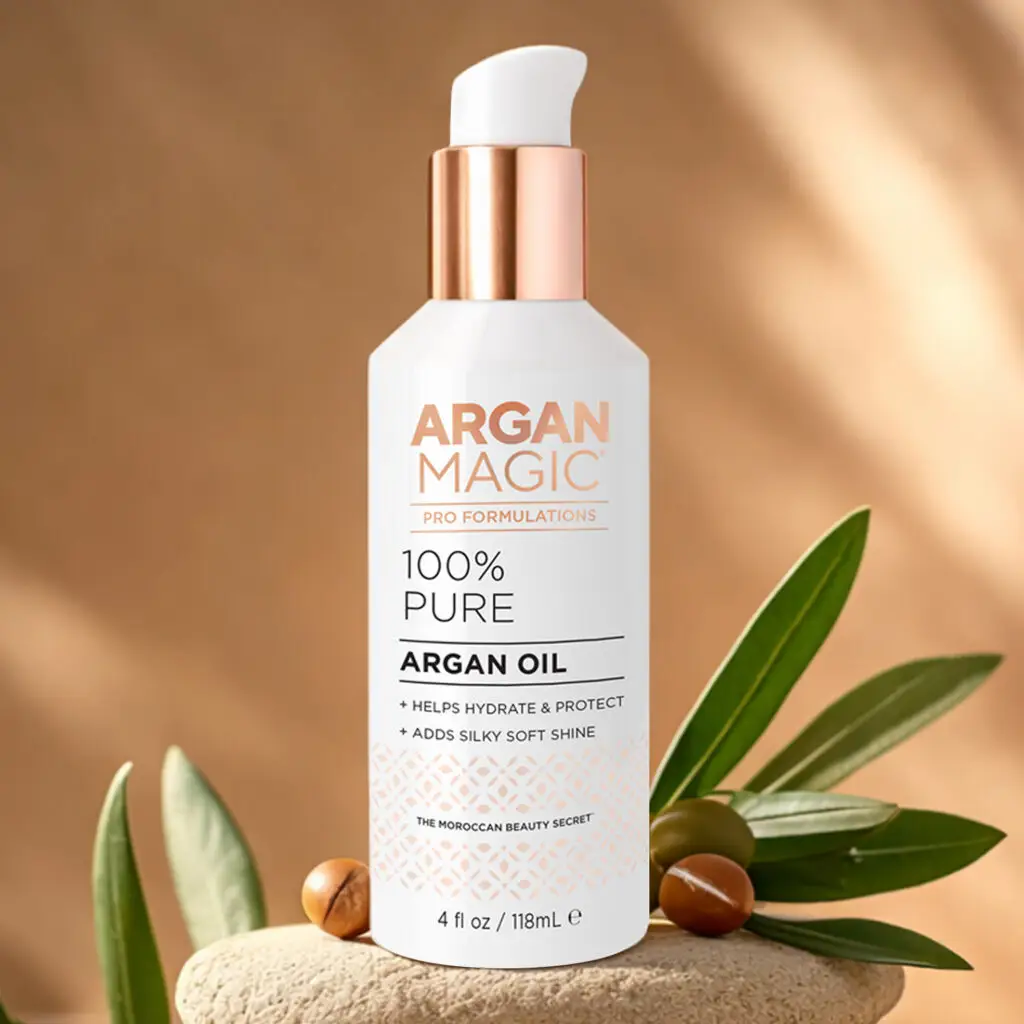
Argan Oil is rich in nourishing fatty acids and antioxidants that help hydrate, smooth and protect, leaving hair that looks shinier, feels softer, and is more manageable.
.brand-text-section {
width: 100%;
max-width: 800px;
aspect-ratio: 1 / 1;
margin: 0 auto;
padding: clamp(28px, 4vw, 50px);
box-sizing: border-box;
text-align: center;
border: 3px solid #f3c4e6;
display: flex;
align-items: center;
justify-content: center;
}
.brand-h2 {
margin: 0;
max-width: 460px;
font-size: clamp(16px, 1.7vw, 24px);
line-height: 1.35;
font-weight: 300;
color: #ffffff;
}
.abril-italic {
font-family: ‘Abril Text’, serif;
font-style: italic;
}
/* iPad / tablet size */
@media screen and (min-width: 768px) and (max-width: 1024px) {
.brand-text-section {
max-width: 500px;
padding: 34px;
}
.brand-h2 {
font-size: clamp(14px, 1.6vw, 18px);
line-height: 1.35;
}
}
/* Mobile */
@media screen and (max-width: 767px) {
.brand-text-section {
max-width: 90vw;
padding: 26px;
}
.brand-h2 {
font-size: clamp(14px, 2vw, 18px);
line-height: 1.35;
}
}